PT
Resumo & Desafio:
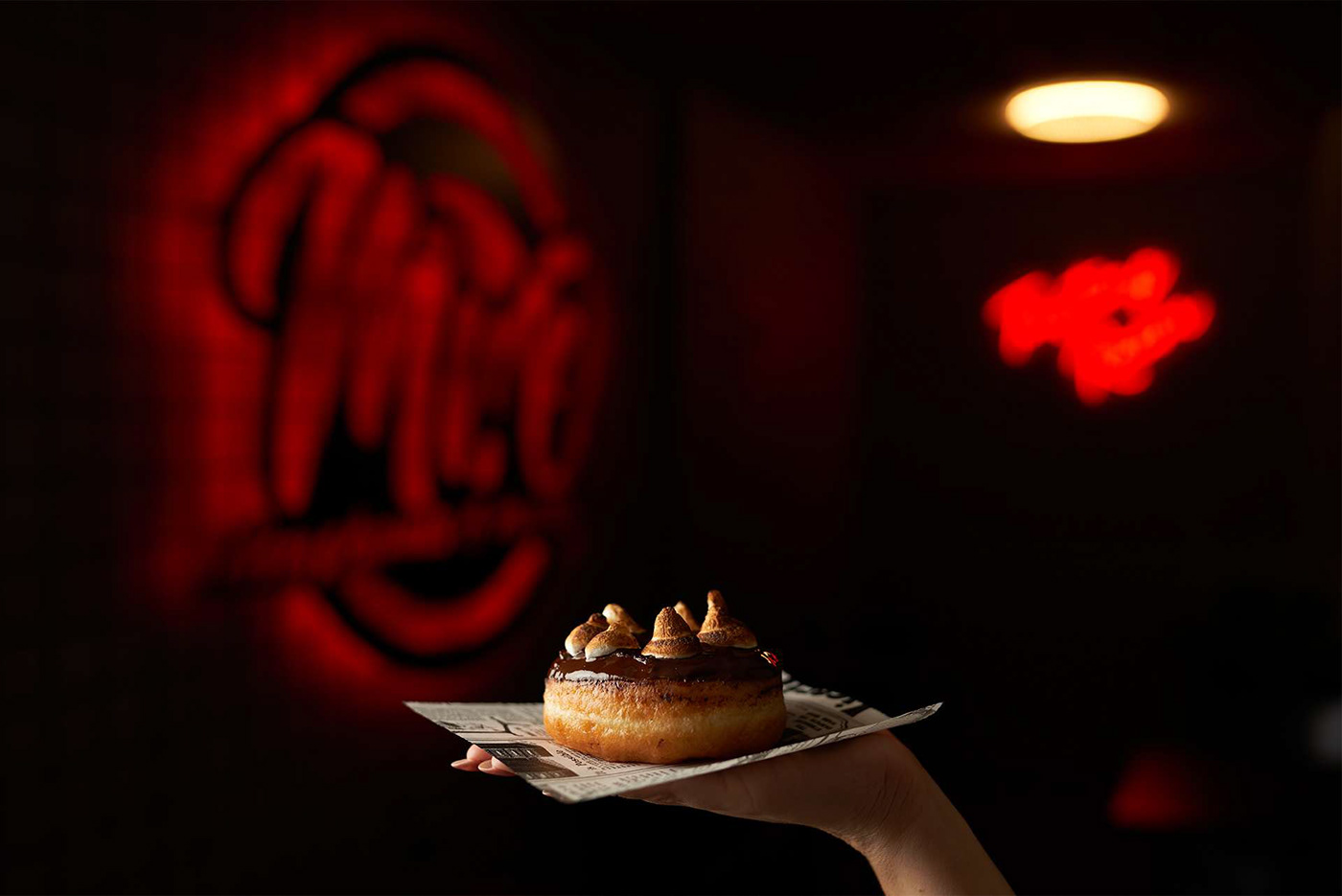
MR.O é um restaurante situado na Póvoa de Varzim, especializado em doughnuts & burgers.
Inaugurado em 2021 e com uma grande caminhada, forte alcance e sucesso, após 2 anos — 2023 — decidiram fazer “all in” e seguir um sonho antigo com a aposta numa carne premium Dry Aged, submetida a uma maturação de 60 dias que torna o sabor e a suculência, perceptíveis a cada trinca.
Com base nessa mudança, um reposicionamento visual da marca era muito importante. O desafio principal foi focar na qualidade premium que queriam representar para expressar de forma impactante esta grande mudança.
Primam desde o primeiro dia de abertura pelo incrível contraste de sabores que contêm em todas as suas receitas, sejam doughnuts ou burgers.
EN
Summary & Challenge:
MR.O is a restaurant located in Póvoa de Varzim, specializing in doughnuts & burgers.
Opened in 2021 and with a long journey, strong reach and success, after 2 years - 2023 - they decided to go "all in" and follow an old dream by betting on premium Dry Aged meat, matured for 60 days which makes the flavor and juiciness noticeable with every bite.
Based on this change, a visual repositioning of the brand was very important. The main challenge was to focus on the premium quality they wanted to represent in order to express this major change in an impactful way.
Since the first day of opening, they have stood out for the incredible contrast of flavors contained in all their recipes, whether doughnuts or burgers.


PT
Na antiga comunicação da marca faltava uma identidade com vida, impactante e que tivesse um grande contraste como já existia nas receitas únicas criadas pelo restaurante.
Com o desafio nas mãos, bem compreendido e após um vasto período de testes chegou-se a um consenso.
Com o desafio nas mãos, bem compreendido e após um vasto período de testes chegou-se a um consenso.
Inicialmente foram definidos dois pontos importantes como uma nova família tipográfica — com a utilização de diferentes pesos; e uma nova paleta de cores — com um maior contraste e vibração das cores.
Posteriormente decidiu-se encontrar dois caminhos visuais, que iriam funcionar juntos para uma boa narrativa da comunicação visual da marca.
A utilização de grafismos — uma grelha, com base nas paredes do interior do restaurante; e ilustrações, com base na diferenciação e apelo emocional dos consumidores.
Ambos os caminhos juntos fazem com que a marca possa ser flexível e crie o impacto desejado, transmitindo assim o grande objetivo com a grande alteração da sua carta.
EN
The Solution:
The brand's old communication lacked a lively, impactful identity that was as contrasting as the unique recipes created by the restaurant.
With the challenge in hand, well understood and after a long period of testing, a consensus was reached.
Initially, two important points were defined: a new typeface - using different weights; and a new color palette - with greater contrast and vibrancy.
It was then decided to find two visual paths that would work together to create a good narrative for the brand's visual communication.
The use of graphics - a grid, based on the walls of the restaurant's interior; and illustrations, based on differentiation and emotional appeal to consumers.
Both paths together allow the brand to be flexible and create the desired impact, thus conveying the major objective with the major change to its menu.